The Carnival Fun Experts — brand guidelines.
Everything you need to make a social post, an email, a flyer, or a piece of stationery feel like it's part of the same brand. If something here is unclear or missing, ask Omar.
1. Logo + mascot
The mark
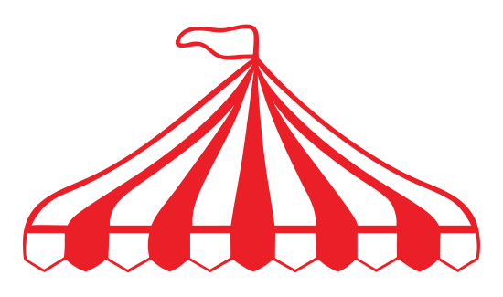
Red striped circus tent on cream. The tent is a separate brand-mark used alongside (not instead of) the wordmark. Available on the company drive in SVG, PNG (transparent), and ICO.
Jack — the mascot
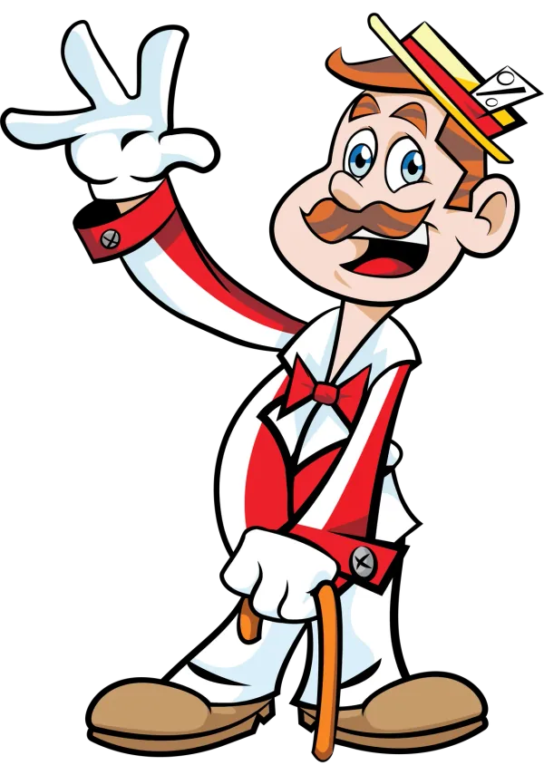
Jack is a friendly carnival barker. Use him as a brand ambassador for playful contexts (social posts, the website chat assistant, fun emails). Keep him at a reasonable size; not a watermark.
Do
- Always put the logo on a clean background — cream (preferred), white, or solid ink.
- Leave breathing room around the logo equal to at least the height of the tent door.
- Pair the logo with the wordmark "The Carnival Fun Experts" in display type when context allows.
- For square contexts (Instagram profile pic), use the tent mark alone, centered on cream.
Don't
- Don't stretch, skew, recolor, or add effects (gradients, shadows, glows) to the logo.
- Don't place the logo on a busy photo background without a solid card behind it.
- Don't write the brand as "TCFE" in customer-facing copy — that's an internal abbreviation only.
- Don't replace Jack with stock clipart or other illustrations — only the official mascot art.
2. Colors
Cream is the canvas. Ink is the type. Red is the accent. Yellow + mint are highlights. Charcoal is for secondary copy. Use the strong red for small text or buttons where the bright red would fail accessibility.
Accessibility: when placing red text on cream, use #C73838 (Red strong), not #E84545. The bright red fails WCAG AA contrast at small sizes; the strong red passes.
3. Typography
Big headlines that feel like a tent flap.
Subheads. Section openers.
- Use for headlines, eyebrows, button labels, anything that wants to lead.
- Weights: 700 (subheads), 800 (h1 + bold display).
- Letter-spacing: tighten slightly (-0.02em to -0.025em) at large sizes.
- Free + self-hosted. Already embedded site-wide.
Body copy carries the actual content. Friendly, plain-English, never jargon. Sentences should sound like a person talking, not a brochure.
Captions, fine print, secondary detail — drop to 13–14px and charcoal.
- Use for body copy, paragraphs, captions, form labels, and anything in a list.
- Weights: 400 (body), 600 (emphasis), 700 (strong inline).
- Base size 16px, line-height 1.55–1.65.
say hi → just for charm moments.
- Sparing use only — one phrase per surface, max.
- Pen-and-paper feel for tags like "say hi →" or "made with way too much popcorn".
- Never use Caveat for body copy, dates, prices, or anything legally meaningful.
4. Visual elements
The brand has a recognizable hardware-store/print-shop feel. A handful of shape rules apply everywhere:
Every card / button / pill gets a 2px ink border + a hard solid-color shadow offset 3-6px below and to the right. No blur. No translucency.
Buttons, eyebrows, tags, and any small label all use fully-rounded pill shapes (border-radius: 999px).
Triangular bunting in red, yellow, mint — used as a decorative band between sections. One row only; never stacked.
Two-color 45° stripes evoke carnival booth siding. Use as accents on photos, dividers, or as a tape graphic. Red+cream or red+ink, never neon combos.
5. Voice + tone
Plain English, never jargon. The brand sounds like a person who's done this 10,000 times and is briefly answering your question. Friendly, never cute. Honest about what's included and what isn't. Confident, never salesy.
Sounds like us
"Backyard birthdays usually run two to four booths plus an inflatable. Six to eight weeks ahead is the sweet spot for booking — earlier in spring and fall."
Doesn't sound like us
"Our innovative event solutions leverage industry-leading carnival entertainment to deliver world-class experiences your guests will never forget."
Sounds like us
"That's outside our service area, but happy to refer you to someone closer. Drop us a note and we'll point you in the right direction."
Doesn't sound like us
"Unfortunately we are unable to service your area at this time. Please consider our partner network for your event needs."
House rules
- Write like a person, not a press release.
- Specific over vague. "$1,295 starting at Premium tier" beats "competitive pricing".
- Avoid exclamation marks. Carnivals are exciting on their own; the punctuation makes us sound desperate.
- Em-dashes are encouraged — they match the rhythm of how the team actually talks.
- Never use ALL CAPS for more than 3 words in a row. (Eyebrows like "★ COMMON QUESTIONS" are the exception.)
- Mention prices as a band ("starts at $1,295" / "$3,000-$15,000+"), never as a guarantee.
- The brand name in copy: "The Carnival Fun Experts" — never abbreviated. Internal-only abbreviation: TCFE.
- Parent brand: My Little Carnival. Use the parent when context calls for it (e.g. legal, BBB, longtime customers).
6. Photography
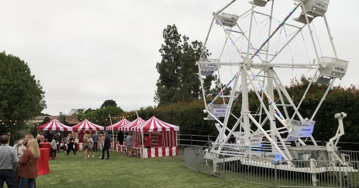
- Real events, real kids, real cities. Stock photos break the trust the rest of the site is selling.
- Daylight + outdoor. The brand lives in California sunlight — most photos should reflect that.
- Crop tight on action. A kid mid-game beats a wide shot of an empty booth.
- Color discipline. Photos that include our reds + creams + yellows feel native. Photos with neon-blue tents or off-brand colors don't.
- Get permission for faces. If a photo has identifiable kids, we need a signed release from the parents before using it externally.
- OG / share images. When making a social card or share preview, use the 1200×630 ratio. Crop tight, leave room for a one-line caption.
7. Examples
Instagram post (1080 × 1080)
packages from $1,295.
Email signature
Business card (3.5 × 2 in)
Front: tent mark + wordmark, centered on cream. Back: ink fill with phone + email + URL in cream, plus a one-line tagline in Caveat ("say hi →") in yellow.
8. Downloads
Logo files and supporting assets live on the shared drive (folder: The Carnival Fun Experts → Brand). If you can't find what you need, ping Omar. Direct on-site assets:
- mlc-logo.svg — the tent mark, SVG (scalable, recolorable).
- favicon.svg — the tent mark in a cream-rounded-square (for app icons + favicons).
- apple-touch-icon.png — 180×180 PNG version.
- og-default.jpg — the default social share image (1200×630).


Questions? Email info@mylittlecarnival.com with subject "Brand question" and we'll get back to you within a day.